Color blindness or color vision deficiency (CVD) affects around 1 in 12 men and 1 in 200 women worldwide. This means that for every 100 users up to 8 of them could actually experience your design much differently that you’d expect.
While the majority of color blind people are able to see things just as clearly as the rest of the population, the difference is in their inability to distinguish red, green, or blue light. The deficiency is the result of a mutation in the X-chromosome, meaning women are more likely to be carriers than sufferers.
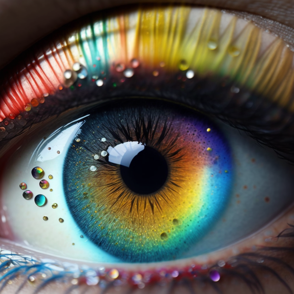
RGB in your eye
According to a popular theory, the human retina has three special cells called cones. Each cone is responsible for one part of the color spectrum: Red, Green and Blue. Each cone reacts to the light it receives and forwards information to the brain. The brain then puts together the data to produce colors we see. Humans don’t actually share the exact same color experience. Since the human eye and brain work together to translate light into color, each and every one of us see colors differently.
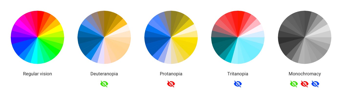
The most common types of color blindness are due to the loss or limited function of red or green cone photopigments. This type of color blindness is generally referred to as red-green color blindness. For example, in people with deuteranopia, there are no working green cone cells, which means that they are unable to see not only green but also the constituent colors with it. The same is with protanopia, but in this case, the individual has no working red cone cells. Blue-yellow color blindness is much rarer than red-green, and an even rarer type of color blindness is called monochromacy (or complete color blindness). Monochromatic people don’t experience colors at all, they distinguish colors only by brightness. In other words, they see the whole world in black and white.
How to design for better color accessibility
You may be asking “why should i design for such a small group of users?”. Designing elements that are favorable for colorblind users is considered to be a good design practice in a grander sense. If your product is already well designed, it should already be accessible to all users. So lets take a look at five tips to design a colorblind-friendly UX:
1. Keep it minimal and simple
The fewer colors you use, the fewer chances for confusion. Aside from being timeless and aesthetically pleasing, minimal designs help users with colorblindness navigate your design with greater ease.
2. Use symbols and color
If you must use red and green together, offer alternate methods of distinguishing elements. Since certain types of colors are difficult for some to see, it is best to also incorporate symbols, directional arrows, labels, annotations, or other indicators that would grab the attention of a person with CVD.
3. Use patterns and textures to show contrast
It is much easier for a colorblind user to distinguish contrasting patterns and textures than colors. For example, when designing a graph you can bring emphasis to important elements using patterns and textures.
4. Use a colorblind-friendly palette when appropriate
There is a range of colors and hues designers can use that can be easily distinguished by those with or without color vision deficiency. For example, blue/orange is a common colorblind-friendly palette. Blue/red or blue/brown would also work. For the most common conditions of CVD, all of these work well, since blue would generally look blue to someone with CVD.
5. Avoid bad color combos
Color blindness affects people in different ways, and since it is difficult to determine ‘safe’ colors its best not to choose combinations that can be challenging for color blind users. Among these color combinations are:
- Green / Red
- Green / Brown
- Blue / Purple
- Green / Blue
- Light Green / Yellow
- Blue / Grey
- Green / Grey
- Green / Black
There may come a scenario where you must use both green and red. In which case, try leveraging light vs. dark. Almost anyone can tell the difference between a very light color and a very dark color.
Conclusion
While there is no one-size-fits-all method for colorblind-friendly design, remembering these tips can help improve how accessible our products are for all users.
Useful resources
The following is a list of useful tools to aid designers in creating colorblind-friendly user experiences.
Coblis: Color Blindness Simulator: Upload an image and take a look at what it’d look like through the eyes of people with different types of color blindness.
A11Y Style Guide: A pattern library focused on accessibility.
Ishihara Color Blindness Test: The most well-known colorblind test.
Funkify: A browser extension that helps you experience the web and interfaces through the eyes of users with different CVD.
Good article. I certainly appreciate this site. Keep writing!
Comments are closed.