// : Use a unique and descriptive class name // : Use a value from 400 to 800 .eb-garamond- { font-family: 'EB Garamond', serif; font-optical-sizing: auto; font-weight: ; font-style: normal; }

January 7, 2025Comments are off for this post.

Navigating Cross-Functional Collaboration as a Product Designer

Cross-functional Teams Help In Building Better Digital Products

Working as a product designer in a cross-functional team is like being part of an intricate dance. The choreography involves developers, product managers, marketers, and other stakeholders, each playing their part in harmony to bring a vision to life. The product design role is unique; you’re not just a participant, you’re also a bridge, connecting different parts of the team to create cohesive and impactful products.

Over the years, I’ve learned that thriving in this environment requires a blend of skills, mindset, and a touch of humility. Here are the attributes that I believe are most important and the strategies that have worked for me throughout my career.

1. Empathy: The Cornerstone of Collaboration

Empathy is at the heart of good design, but it’s equally critical in team dynamics. Understanding your teammates' goals, challenges, and perspectives fosters trust and smoother collaboration. Developers might prioritize feasibility and efficiency, while marketers are focused on positioning and user acquisition. By empathizing with their priorities, you can frame your design decisions in ways that resonate with their goals, bridging gaps and aligning everyone towards a common vision.

2. Clear and Frequent Communication

When working in a cross-functional team, clarity is king. Ambiguities can lead to misaligned expectations and, ultimately, frustration. Early in my career, I learned the power of over-communicating. Share updates regularly, clarify your design rationale, and ask for feedback often. Tools like Slack, Figma, and collaborative documents have become my best friends for staying transparent and accessible.

3. Adaptability: Embracing Change

Cross-functional teams are dynamic by nature. Priorities shift, timelines compress, and requirements evolve. As a designer, being flexible and maintaining a problem-solving mindset helps you stay effective. I’ve found it useful to frame changes as opportunities to refine and improve rather than setbacks.

4. Collaboration Over Ownership

While you might take pride in your craft, it’s crucial to remember that products are built collectively. It is common for designers early in their career to feel protective of their work, but embracing diverse perspectives will almost always strengthen the final product.

5. Being an Advocate for the User

In the whirlwind of deadlines and business goals, it’s easy for user needs to get overshadowed. As a designer, you’re the voice of the user. Anchoring discussions around user feedback and usability testing results ensures the team’s decisions are rooted in real needs, not assumptions. Balancing this advocacy with team goals—without becoming overly dogmatic—is an art worth mastering.

What’s Worked for Me

1. Starting With a Shared Vision

One of the most valuable lessons I’ve learned is the importance of aligning on goals from the start. Kickoff meetings where the entire team agrees on objectives, user pain points, and success metrics set the tone for collaboration. When everyone is on the same page, it’s easier to navigate conflicts and stay focused.

2. Building Relationships

Work isn’t just about deliverables; it’s about people. Taking the time to understand your teammates as individuals—their working styles, preferences, and even hobbies—builds rapport and makes collaboration more enjoyable. A developer who knows you appreciate their effort is more likely to go the extra mile for your design.

3. Iterating Together

Collaboration doesn’t end with handing off designs. Working closely with developers during implementation ensures that the final product aligns with the vision. Addressing questions in real time and being open to tweaks during development have been game-changers for me.

Final Thoughts

Working as a product designer in a cross-functional team can be challenging, but it’s also deeply rewarding. The interplay of diverse expertise leads to richer solutions than any of us could create alone. By promoting empathy, communication, adaptability, and a collaborative spirit, you not only contribute to great products but also grow as a professional.

Remember: the best outcomes happen when the team’s success takes precedence over individual contributions. When you focus on building trust, fostering open dialogue, and championing the user, you’ll find yourself thriving in the intricate dance of cross-functional collaboration.

April 5, 2023Comments are off for this post.

Designing Colorblind-Friendly User Experiences

Color blindness or color vision deficiency (CVD) affects around 1 in 12 men and 1 in 200 women worldwide. This means that for every 100 users up to 8 of them could actually experience your design much differently that you’d expect.

While the majority of color blind people are able to see things just as clearly as the rest of the population, the difference is in their inability to distinguish red, green, or blue light. The deficiency is the result of a mutation in the X-chromosome, meaning women are more likely to be carriers than sufferers.

RGB in your eye

According to a popular theory, the human retina has three special cells called cones. Each cone is responsible for one part of the color spectrum: Red, Green and Blue. Each cone reacts to the light it receives and forwards information to the brain. The brain then puts together the data to produce colors we see. Humans don’t actually share the exact same color experience. Since the human eye and brain work together to translate light into color, each and every one of us see colors differently.

The most common types of color blindness are due to the loss or limited function of red or green cone photopigments. This type of color blindness is generally referred to as red-green color blindness. For example, in people with deuteranopia, there are no working green cone cells, which means that they are unable to see not only green but also the constituent colors with it. The same is with protanopia, but in this case, the individual has no working red cone cells. Blue-yellow color blindness is much rarer than red-green, and an even rarer type of color blindness is called monochromacy (or complete color blindness). Monochromatic people don’t experience colors at all, they distinguish colors only by brightness. In other words, they see the whole world in black and white.

How to design for better color accessibility

You may be asking “why should i design for such a small group of users?”. Designing elements that are favorable for colorblind users is considered to be a good design practice in a grander sense. If your product is already well designed, it should already be accessible to all users. So lets take a look at five tips to design a colorblind-friendly UX:

1. Keep it minimal and simple

The fewer colors you use, the fewer chances for confusion. Aside from being timeless and aesthetically pleasing, minimal designs help users with colorblindness navigate your design with greater ease.

2. Use symbols and color

If you must use red and green together, offer alternate methods of distinguishing elements. Since certain types of colors are difficult for some to see, it is best to also incorporate symbols, directional arrows, labels, annotations, or other indicators that would grab the attention of a person with CVD.

3. Use patterns and textures to show contrast

It is much easier for a colorblind user to distinguish contrasting patterns and textures than colors. For example, when designing a graph you can bring emphasis to important elements using patterns and textures.

4. Use a colorblind-friendly palette when appropriate

There is a range of colors and hues designers can use that can be easily distinguished by those with or without color vision deficiency. For example, blue/orange is a common colorblind-friendly palette. Blue/red or blue/brown would also work. For the most common conditions of CVD, all of these work well, since blue would generally look blue to someone with CVD.

5. Avoid bad color combos

Color blindness affects people in different ways, and since it is difficult to determine ‘safe’ colors its best not to choose combinations that can be challenging for color blind users. Among these color combinations are:

  • Green / Red
  • Green / Brown
  • Blue / Purple
  • Green / Blue
  • Light Green / Yellow
  • Blue / Grey
  • Green / Grey
  • Green / Black

There may come a scenario where you must use both green and red. In which case, try leveraging light vs. dark. Almost anyone can tell the difference between a very light color and a very dark color.

Conclusion

While there is no one-size-fits-all method for colorblind-friendly design, remembering these tips can help improve how accessible our products are for all users.

Useful resources

The following is a list of useful tools to aid designers in creating colorblind-friendly user experiences.

Coblis: Color Blindness Simulator: Upload an image and take a look at what it’d look like through the eyes of people with different types of color blindness.

A11Y Style Guide: A pattern library focused on accessibility.

Ishihara Color Blindness Test: The most well-known colorblind test.

Funkify: A browser extension that helps you experience the web and interfaces through the eyes of users with different CVD.

April 5, 2023Comments are off for this post.

7 Principles of Design Every Designer Should Know

The principles of design are fundamental pieces of advice for designers to make designs that are aesthetic, meaningful and keep their users engaged. Many professionals from various disciplines (behavioral science, sociology, physics and ergonomics) have provided the foundation for these design principles through accumulated knowledge and experience.

1. The Gestalt Principles

Gestalt (meaning “form” or “Shape” in German) Principles follow the law that says “The Whole is greater than the sum of its individual parts.” There are 6 rules that make up Gestalt Principles: Proximity, Similarity, Symmetry, Common Fate, Closure and the Law of Pragnanz.

— Proximity

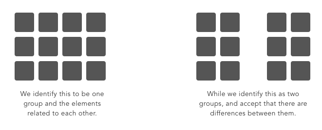
The principle of Proximity states that things that are close together appear to be more related than things that are spaced farther apart.

Proximity is so influential that it can override other factors that may differentiate the objects, such as color or shape.

— Similarity

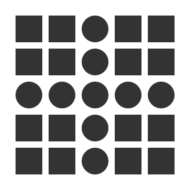
The Law of Similarity is a principle of association stating that like produces like.

Similarity captures the idea that elements will be grouped perceptually if they are similar to each other.

— Symmetry

Objects that are balanced and symmetrical are seen as complete or whole. Elements that are symmetrical to each other tend to be perceived as a unified group.

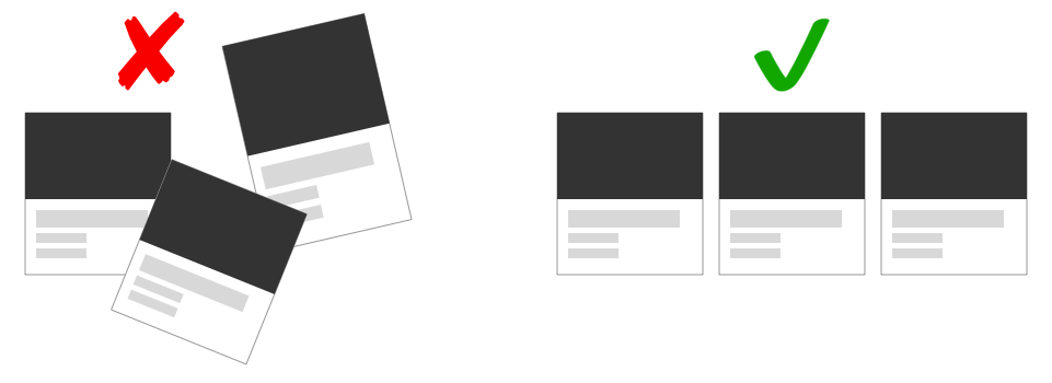
Designers can monitor Symmetry through Grid systems which is used to structure content.

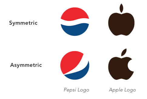
It is important to consider that, if used properly, breaking symmetry and creating an asymmetrical design can still yield a beautiful design.

Pepsi and Apple’s logos would not be the same if they had to adhere to the principle of symmetry.

— Closure

The principle of closure states that people tend to fill in blanks to perceive a complete object whenever an external stimuli partially matches that object.

If done correctly, designers can manipulate negative space in creative and respectable ways to generate interesting designs.

— Law of Pragnanz (Figure — Ground)

The Law of Pragnanz, or, the law of “good figure,” suggests that when people are presented with a visual field, certain objects take a more prominent role (figures, elements of focus), while others recede into the background (ground, the background in which the figure rests).

In this basic example, we can see the relation between the focus (smaller square) versus the ground (larger square.) Our brains tell us that the smaller box is in the forefront. Designers can create a good figure-ground by playing with Contrast, Color, Size, Position and Focus.

— Common Fate

The Law of Common Fate states that humans perceive elements moving in the same direction as being more related than elements that are stationary or moving in different directions.

2. Hicks Law

Hick's Law (or the Hick-Hyman Law) articulates that the more choices (or stimuli) users face, the longer it will take them to make a decision. This creates a challenge for designers: offer the most useful set of options or risk frustrating the user.

A classic case study for Hick’s law involves a grocery store which put out cookies for customers to taste. In one case they had put out 40 different varieties of cookies for the shoppers to choose from. In another case they only put out 3 flavors of cookies. They discovered that more customers opted to buy the cookies when presented with a much smaller selection.

In the design world, an excess amount of information available to a person is referred as “Information Overload.” This impedes the decision-making process, resulting in a poor (or even no) decision being made.

3. Fitts’ Law

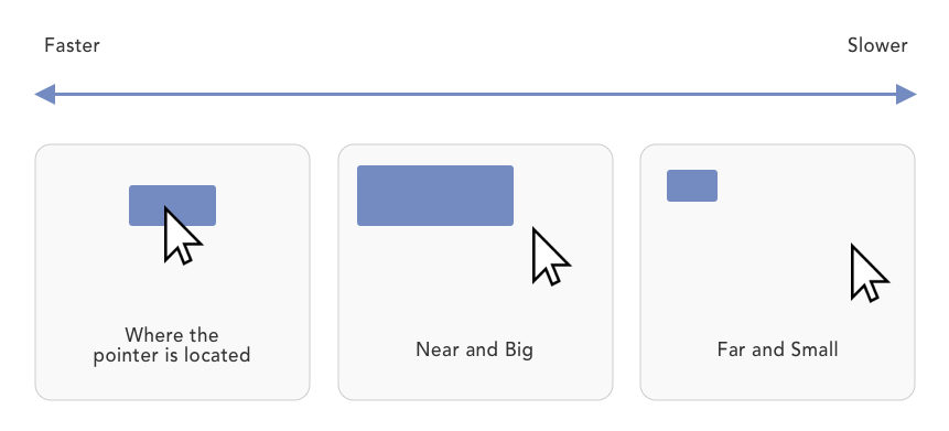
Fitts’ Law is a predictive model of human movement that is primarily used in human-computer interaction. Simply put, the longer the distance and the smaller the target's size, the longer it takes to reach.

4. Pareto Principal (80/20 rule)

The Pareto Principle, or the 80/20 rule as its also known, is a productivity hack of sorts. It stipulates that 80% of your users use 20% of your features. In other words, most of your users are going to go to a small percentage of pages (or perform a small percentage of tasks.) At the end of the day, it’s a matter of narrowing your focus down to essential cause and effect principles, so as to prioritize your attention and resources. You must ask yourself what aspect of your product holds the most value and work from there.

5. Miller’s Law

Miller's Law states that the number of objects an average person can hold in working memory is about seven, also known as The Magical Number Seven, Plus or Minus Two. In case your users need to make a choice, don't give an overwhelming number of choices to them. Break down and group information into smaller pieces.

6. The Golden Ratio (Fibonacci Sequence)

The Golden Ratio is a unique mathematical relationship. It is a never-ending sequence that starts with 0 + 1 and is calculated by taking the sum of the 2 numbers that precede it. Think of it as a simple mathematical equation where 0+1 = 1. 1+2 = 3. 2+3 = 5, and so forth until we reach the Golden Ratio at approximately 1.618.

Using the Fibonacci sequence as a blueprint for your designs can help you create aesthetically pleasing results.

7. The Rule of Thirds

Frequently used by photographers, The Rule of Thirds is a composition guideline that places your point of interest in the right or left third of an image or design. This brings the attention to a special part of a photo (or design) and creates an interesting composition.

You can apply the Rule of Thirds to any design or photo by cutting the piece into 9 squares and placing your point of interest on any of the intersecting lines. The result is often a compelling and well-composed photo or design.

Conclusion

Design Principles are a set of considerations that form the basis of any good product. You should practice them and learn when and how to use them on a project by project basis. Use discretion as you adapt the principles to each case and build solid user experiences.

April 5, 2023Comments are off for this post.

The Golden Ratio and Its Application In Design

The proportion known as the Golden Ratio has always existed in mathematics and in the physical universe. And while it is uncertain when it was first discovered, we know that the ratio was often used throughout history by designers, philosophers and architects when creating aesthetically pleasing designs and structures. We can find the ratio applied in many historical structures and design; from the Pyramids in Egypt, to the Parthenon in Greece.

What exactly is the ratio?

The Golden Ratio is a unique mathematical relationship. It is a never-ending sequence that starts with 0 + 1 and is calculated by taking the sum of the 2 numbers that precede it. Think of it as a simple mathematical equation where 0+1 = 1. 1+2 = 3. 2+3 = 5, and so forth until we reach the Golden Ratio at approximately 1.618.

The Golden Ratio is often times called the “Divine Proportion” because it appears so often in the natural world. It can be seen in many things including galaxies, the human face, and sunflowers. It is because of this that the ratio has been discovered and rediscovered throughout history, explaining why the ratio goes by so many names (the golden mean, PHI, and the divine proportion, etc.)

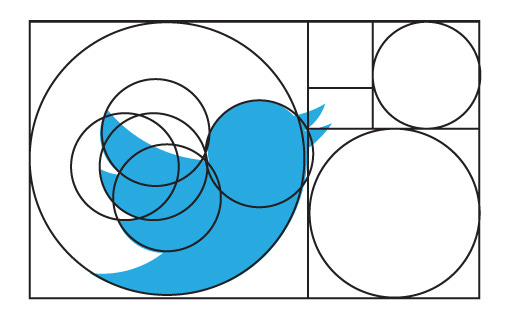
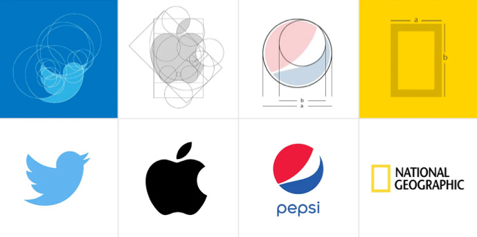
It is because of this natural influence that many famous and recognizable brand logos including Twitter, Apple, Pepsi and National Geographic have incorporated the ratio into their design. The human eye is used to seeing this magical number and we subconsciously react positively to it. Brands know this.

And while it is not imperative to follow the Golden Ratio to arrive at a great design, it does offer a framework designers can leverage in many aspects of their work. Whether it be sketches, brand development, or production ready designs.

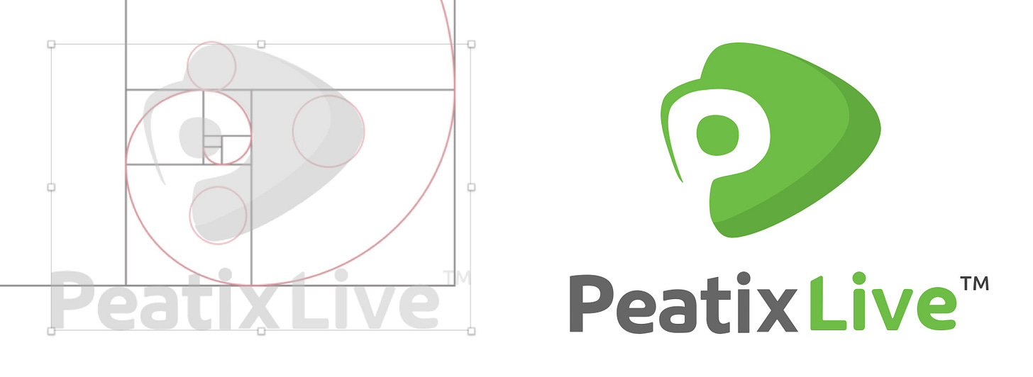
In the following example I used the sequence to create a golden spiral. Which I then used to create a logo for Peatix’s live streaming service.

The result was an aesthetically pleasing design made possible by, thats right, math. Once you know what to look for, you’ll start noticing the Golden Ratio everywhere. And as designers, we can use this number to our advantage.