The principles of design are fundamental pieces of advice for designers to make designs that are aesthetic, meaningful and keep their users engaged. Many professionals from various disciplines (behavioral science, sociology, physics and ergonomics) have provided the foundation for these design principles through accumulated knowledge and experience.
1. The Gestalt Principles
Gestalt (meaning “form” or “Shape” in German) Principles follow the law that says “The Whole is greater than the sum of its individual parts.” There are 6 rules that make up Gestalt Principles: Proximity, Similarity, Symmetry, Common Fate, Closure and the Law of Pragnanz.
— Proximity
The principle of Proximity states that things that are close together appear to be more related than things that are spaced farther apart.
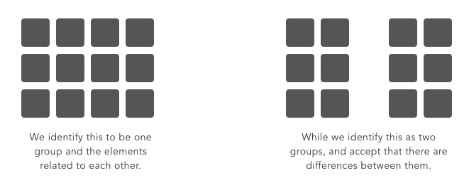
Proximity is so influential that it can override other factors that may differentiate the objects, such as color or shape.
— Similarity
The Law of Similarity is a principle of association stating that like produces like.
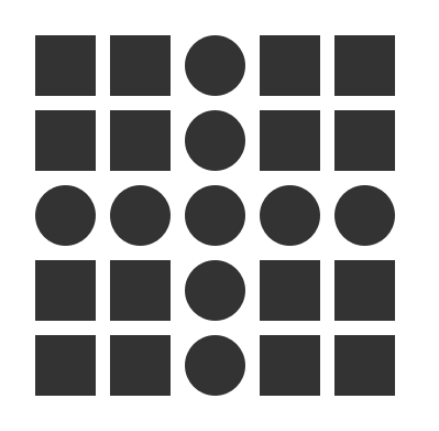
Similarity captures the idea that elements will be grouped perceptually if they are similar to each other.
— Symmetry
Objects that are balanced and symmetrical are seen as complete or whole. Elements that are symmetrical to each other tend to be perceived as a unified group.
Designers can monitor Symmetry through Grid systems which is used to structure content.
It is important to consider that, if used properly, breaking symmetry and creating an asymmetrical design can still yield a beautiful design.
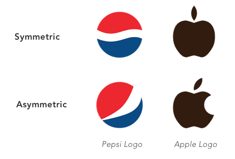
Pepsi and Apple’s logos would not be the same if they had to adhere to the principle of symmetry.
— Closure
The principle of closure states that people tend to fill in blanks to perceive a complete object whenever an external stimuli partially matches that object.

If done correctly, designers can manipulate negative space in creative and respectable ways to generate interesting designs.
— Law of Pragnanz (Figure — Ground)
The Law of Pragnanz, or, the law of “good figure,” suggests that when people are presented with a visual field, certain objects take a more prominent role (figures, elements of focus), while others recede into the background (ground, the background in which the figure rests).

In this basic example, we can see the relation between the focus (smaller square) versus the ground (larger square.) Our brains tell us that the smaller box is in the forefront. Designers can create a good figure-ground by playing with Contrast, Color, Size, Position and Focus.
— Common Fate
The Law of Common Fate states that humans perceive elements moving in the same direction as being more related than elements that are stationary or moving in different directions.

2. Hicks Law
Hick's Law (or the Hick-Hyman Law) articulates that the more choices (or stimuli) users face, the longer it will take them to make a decision. This creates a challenge for designers: offer the most useful set of options or risk frustrating the user.
A classic case study for Hick’s law involves a grocery store which put out cookies for customers to taste. In one case they had put out 40 different varieties of cookies for the shoppers to choose from. In another case they only put out 3 flavors of cookies. They discovered that more customers opted to buy the cookies when presented with a much smaller selection.
In the design world, an excess amount of information available to a person is referred as “Information Overload.” This impedes the decision-making process, resulting in a poor (or even no) decision being made.
3. Fitts’ Law
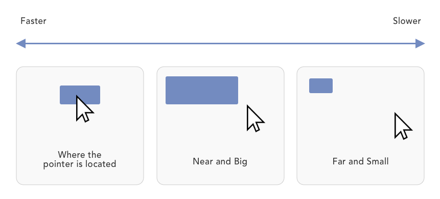
Fitts’ Law is a predictive model of human movement that is primarily used in human-computer interaction. Simply put, the longer the distance and the smaller the target's size, the longer it takes to reach.
4. Pareto Principal (80/20 rule)
The Pareto Principle, or the 80/20 rule as its also known, is a productivity hack of sorts. It stipulates that 80% of your users use 20% of your features. In other words, most of your users are going to go to a small percentage of pages (or perform a small percentage of tasks.) At the end of the day, it’s a matter of narrowing your focus down to essential cause and effect principles, so as to prioritize your attention and resources. You must ask yourself what aspect of your product holds the most value and work from there.
5. Miller’s Law
Miller's Law states that the number of objects an average person can hold in working memory is about seven, also known as The Magical Number Seven, Plus or Minus Two. In case your users need to make a choice, don't give an overwhelming number of choices to them. Break down and group information into smaller pieces.
6. The Golden Ratio (Fibonacci Sequence)
The Golden Ratio is a unique mathematical relationship. It is a never-ending sequence that starts with 0 + 1 and is calculated by taking the sum of the 2 numbers that precede it. Think of it as a simple mathematical equation where 0+1 = 1. 1+2 = 3. 2+3 = 5, and so forth until we reach the Golden Ratio at approximately 1.618.
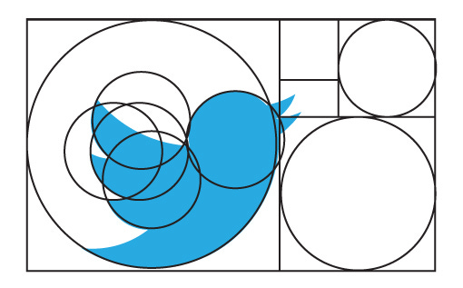
Using the Fibonacci sequence as a blueprint for your designs can help you create aesthetically pleasing results.
7. The Rule of Thirds
Frequently used by photographers, The Rule of Thirds is a composition guideline that places your point of interest in the right or left third of an image or design. This brings the attention to a special part of a photo (or design) and creates an interesting composition.

You can apply the Rule of Thirds to any design or photo by cutting the piece into 9 squares and placing your point of interest on any of the intersecting lines. The result is often a compelling and well-composed photo or design.
Conclusion
Design Principles are a set of considerations that form the basis of any good product. You should practice them and learn when and how to use them on a project by project basis. Use discretion as you adapt the principles to each case and build solid user experiences.
No comments.